CAPISCE SICILIAN ARANCINA
This 15-week project reimagined as a Sicilian classic as a walk-up window restaurant featuring a coastal aesthetic with deep ocean blue accents, inviting customers to savor a taste of Sicily.
The competition consisted of many red, white, and green logos and brands, so I saw an opportunity to celebrate my love for my Sicilian heritage in to every aspect of the design. Capisce isn't just a restaurant - it's a celebration of Sicilian culture, a labor of love that pays homage to the flavors and traditions of the beloved island.
Includes
Brand Design
Logo Design
Typography
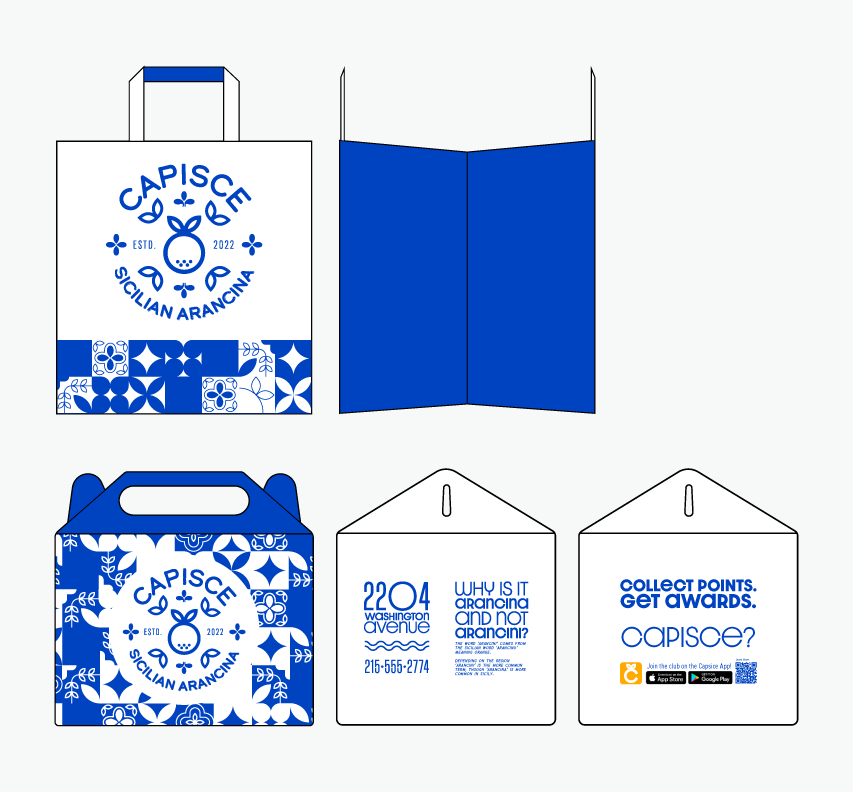
Package Design
UI/UX
Environmental Design
Software
Adobe Illustrator
Adobe InDesign
Adobe Photoshop
Adobe 3D Stager
Nominations
Click Here to view
The logo itself uses a bespoke typeface mimicking the shape of the arancina.
Dazzle Unicase, a typeface similar to that of the logo was used for any instance the rounded counter-typeface wanted to be used.
Lorimer No 2 Condensed Light is used for all the subtext, inspired by the conical shape that some arancini could be shaped as.
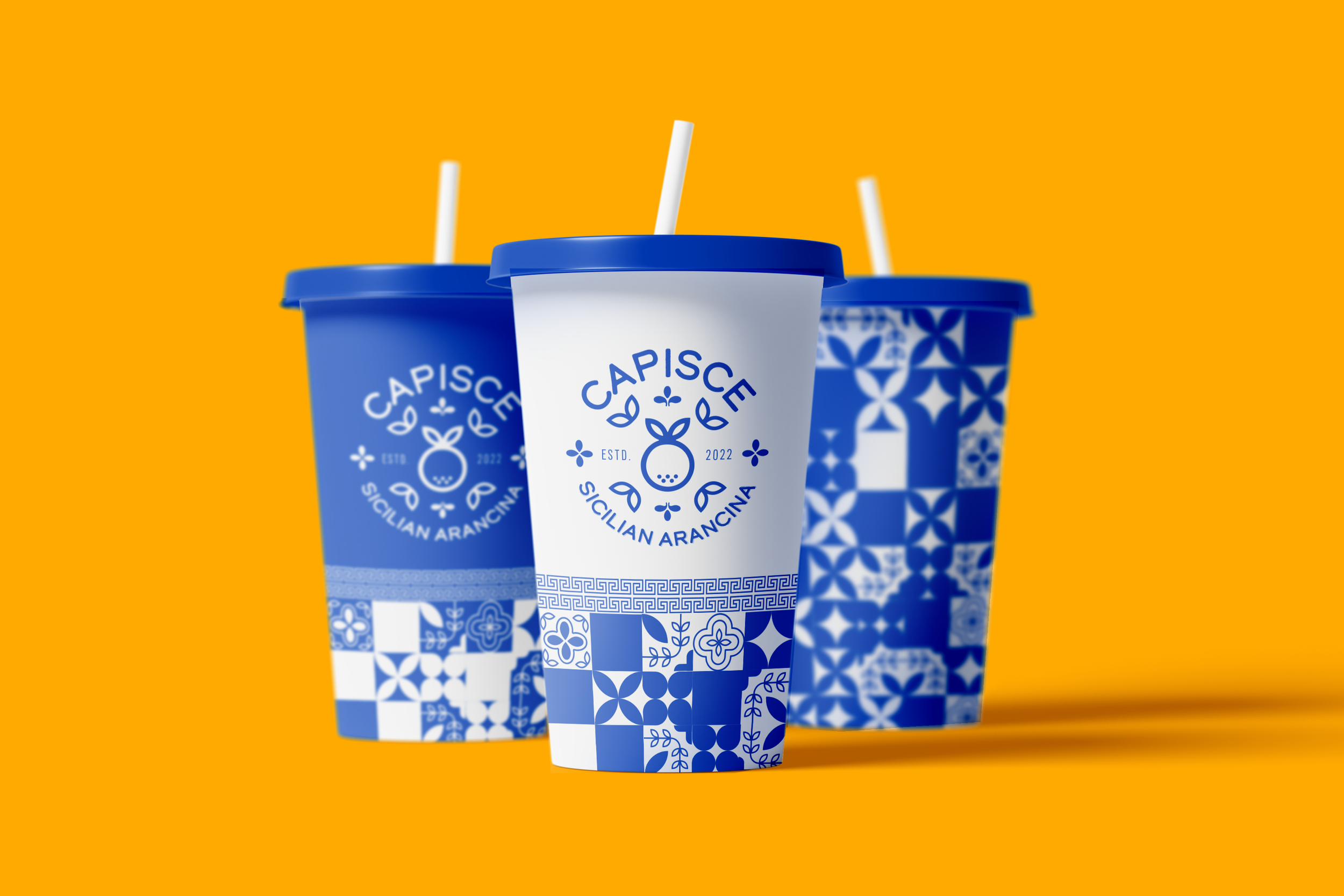
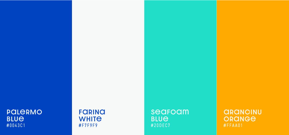
Utilizing blue as the main color, I used it to evoke the inspiration of the coastal Sicilian towns, where the vast expanse of the ocean stretches as far as the eye can see.
Given that arancina might be a new culinary experience for many, the choice of blue was also intended to exude approachability and dependability.
The process started like no other.
The logo began with sketches of multiple different concepts and slowly evolved into a cohesive and meaningful brand.
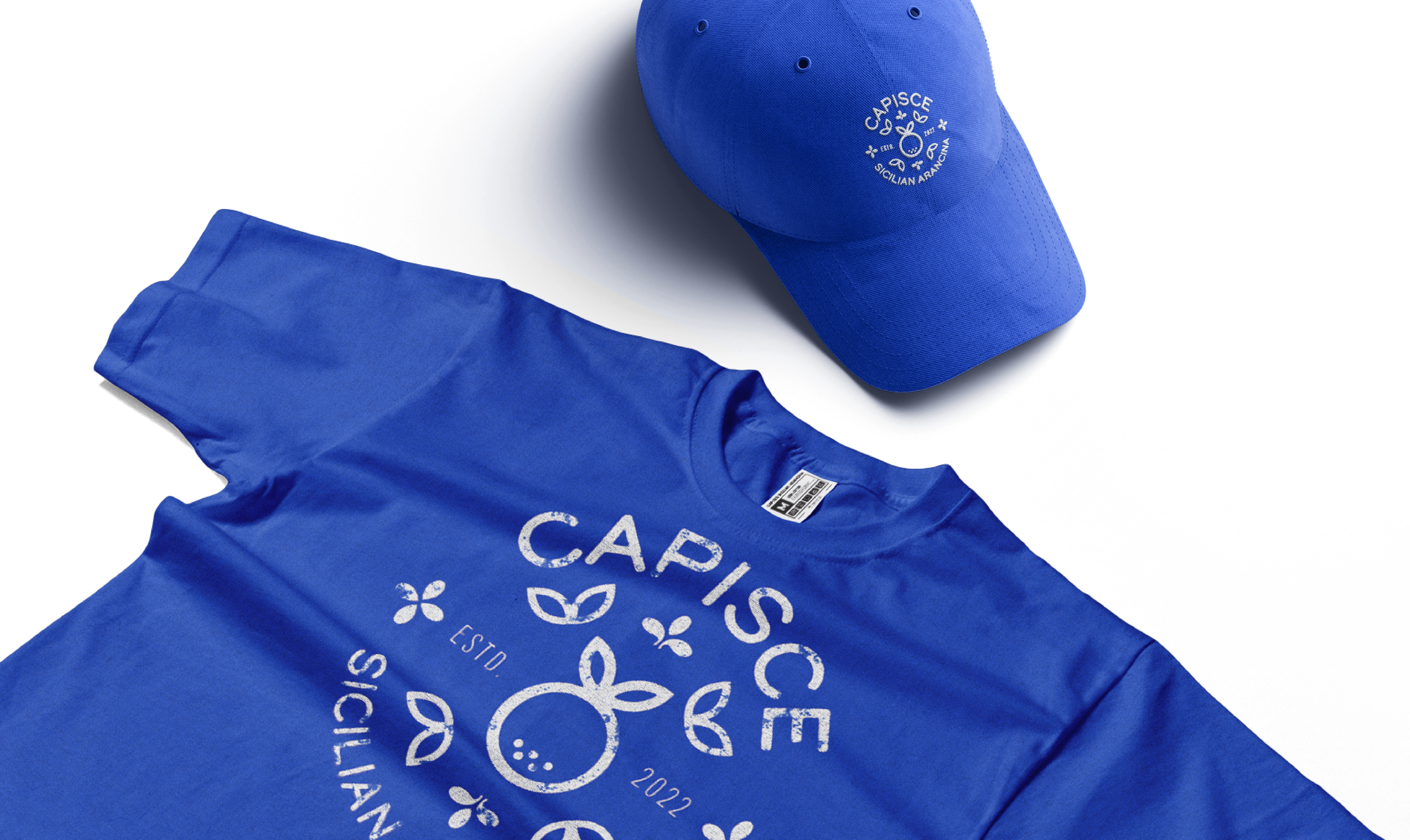
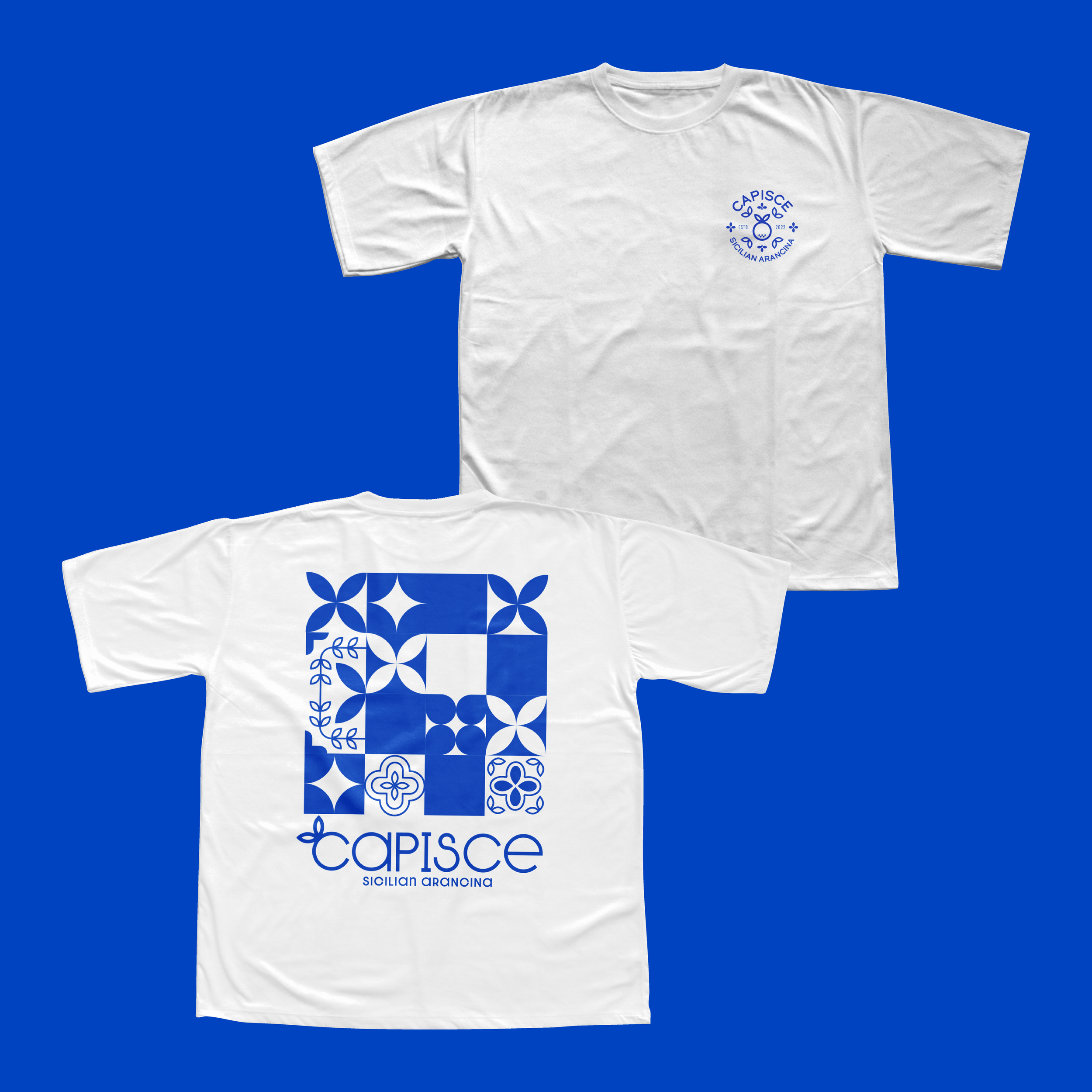
I knew when creating the logo I wanted to incorporate the sway of a coastal wave with the round shape of an orange. I soon decided I wanted the type in the logo to stay round with low contrast counters. The low contrast type also helped when layering the logo or type over the brand pattern, giving it a solid base to maximize legibility.
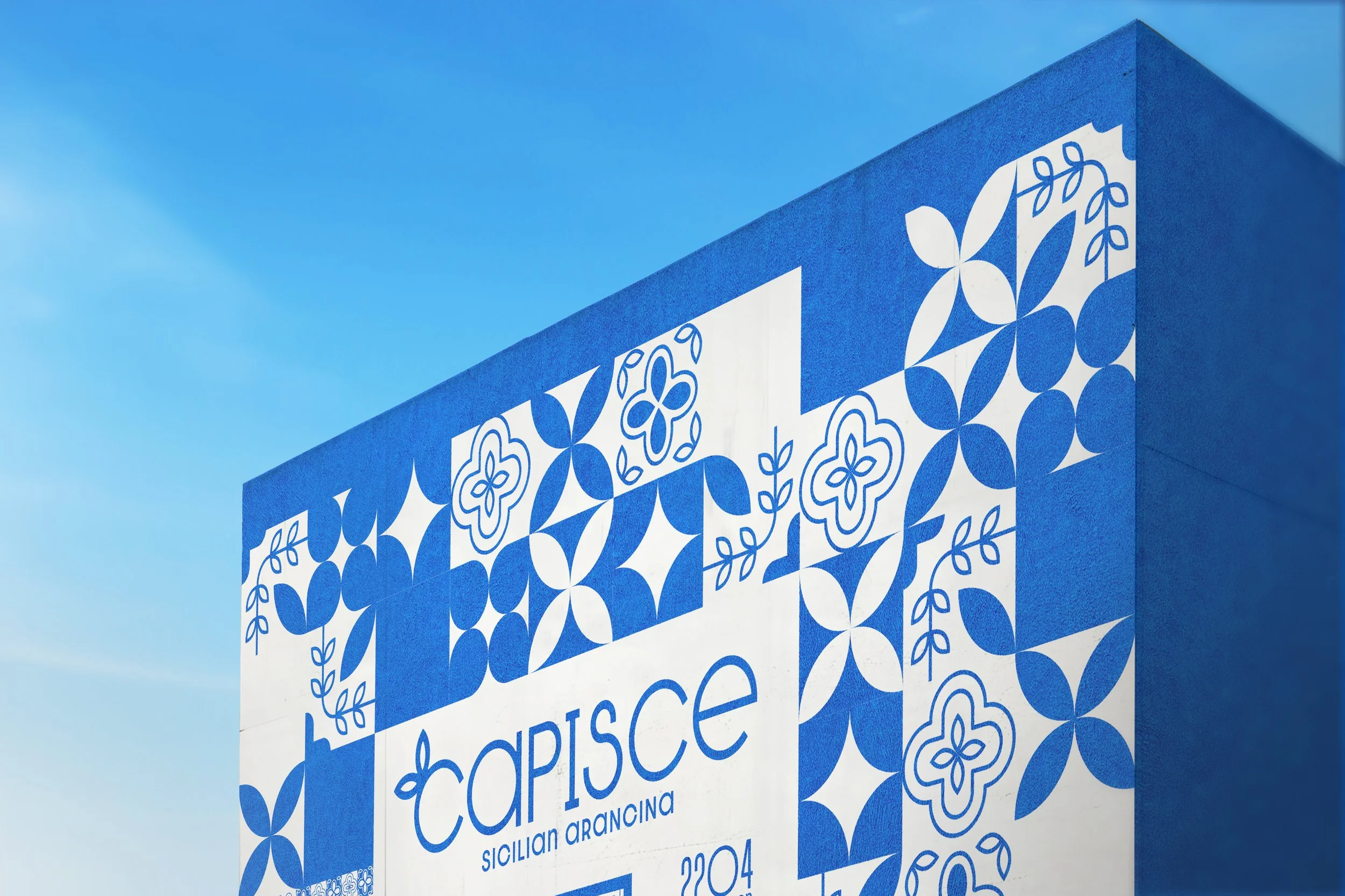
The restaurant’s exterior consists of a mural facade.
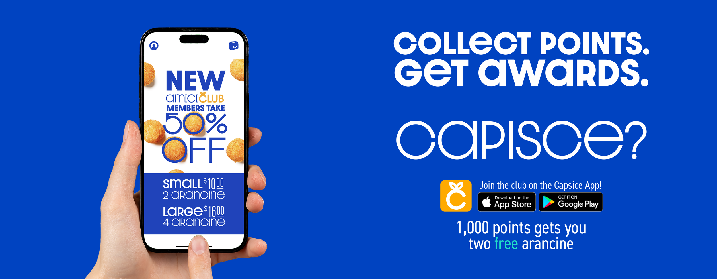
Creating an experience similar to a food truck or drive-thru window, this restaurant is imagined as a take-out window where customers would order and receive their food at a window. This gives a lot of opportunities to do out-of-the-box thinking about the environmental design.
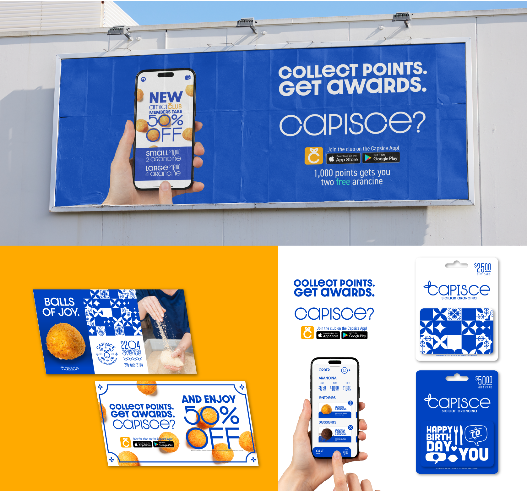
I went with a painted facade, along with a painted menu on the front of the building. This saves the customers and the workers from the hassle of paper menus. During the warmer months, the restaurant would offer outdoor seating.
Designer’s notes
This project was a huge project with many different meticulous parts to it. It’s been an experience like no other. I learned how to manage my time more, and realized that I shouldn’t jump the gun as much. I found myself wanting to do the mockups before I was completely confident in my logo, this required me to go back and forth with fixing mockups and rerendering them which is a lot of time wasted.
I learned many new tricks for making my own mockups and how to do environmental design. I really enjoyed the challenge that this project gave and felt confident about my skills towards the end of the project.
Read the full story here: Capisce Sicilian Aracina by Christian van der Kleut
Nominations
I get the honor to share that my project, Capisce Sicilian Aracina, was nominated as a finalist under the Brand Identity category in the 2024 Flux Student Design Competition hosted by AIGA (American Institute of Graphic Arts) Baltimore.
Check out my work, as well as all of the other nominees here: 2024 Flux Student Design Competition Nominees
Instructor
Nathan Young
(Tyler School of Art & Architecture / Temple University)


