SÈVE PREMIUM TEAS
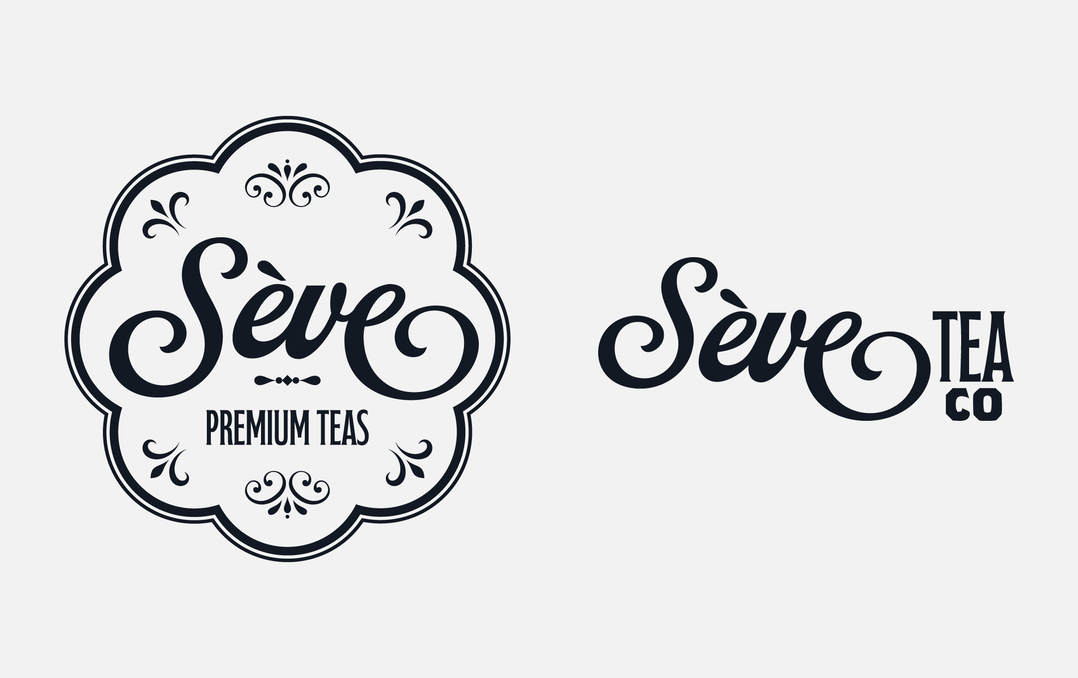
Sève Premium Teas began as a way to create an upscale premium tea brand. The primary objective was to redefine what luxury could look like in everyday settings, making premium teas accessible without sacrificing their core identity of elegance and quality.
Includes
Brand System
Package Design
Logo Design
Typography
Mockups
Software
Adobe Illustrator
Adobe Photoshop
After creating playful brands, it was time to switch it up.
I had a lack of practice with creating a more high-end, luxurious brand so I decided to create an upscale French brand of premium chilled teas.
This project had been assigned to me as a design sprint, with only a few weeks to complete this project. That all consisted of creating the concepts of a brand, the brand elements, as well as mockups and advertising.
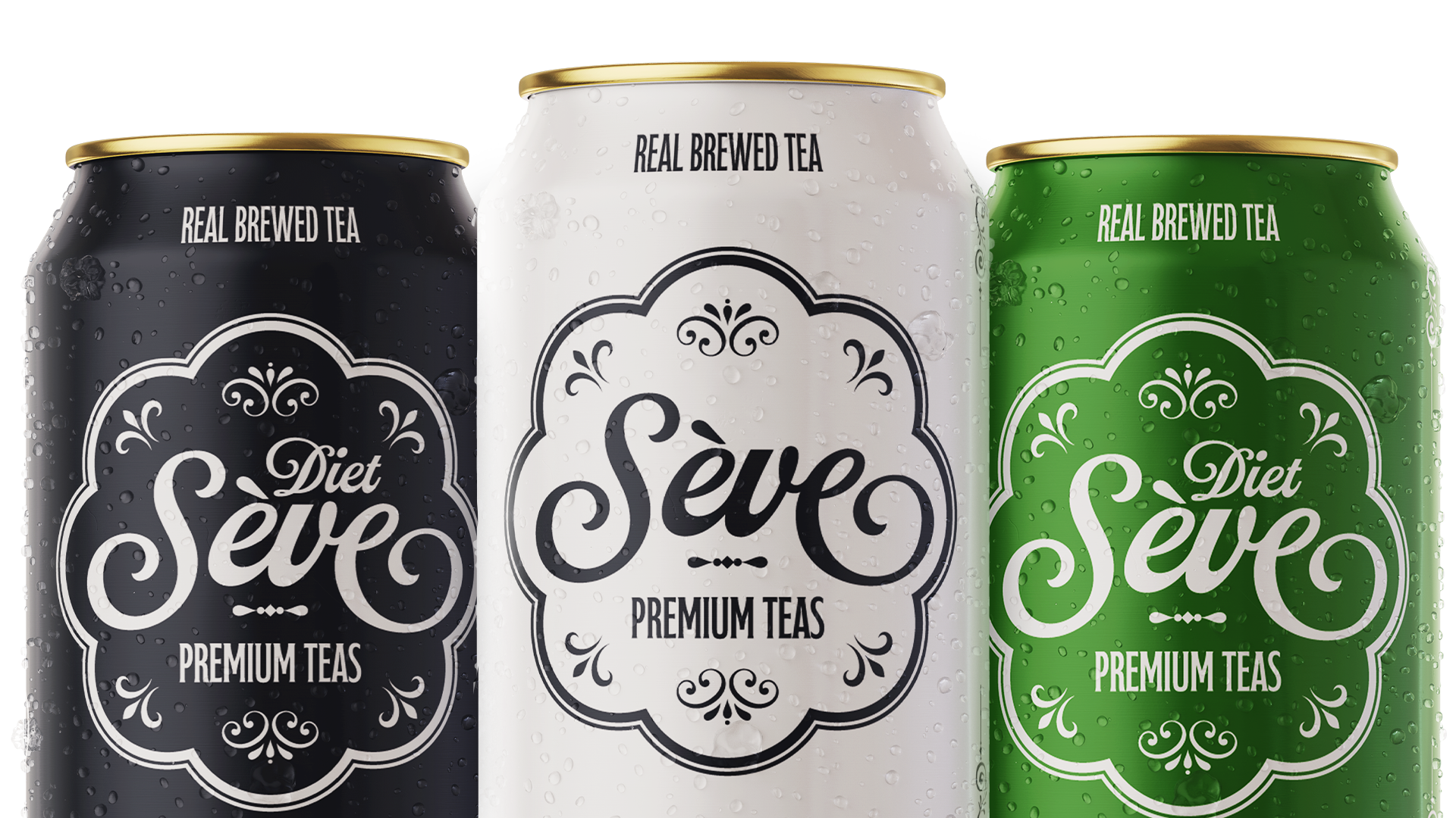
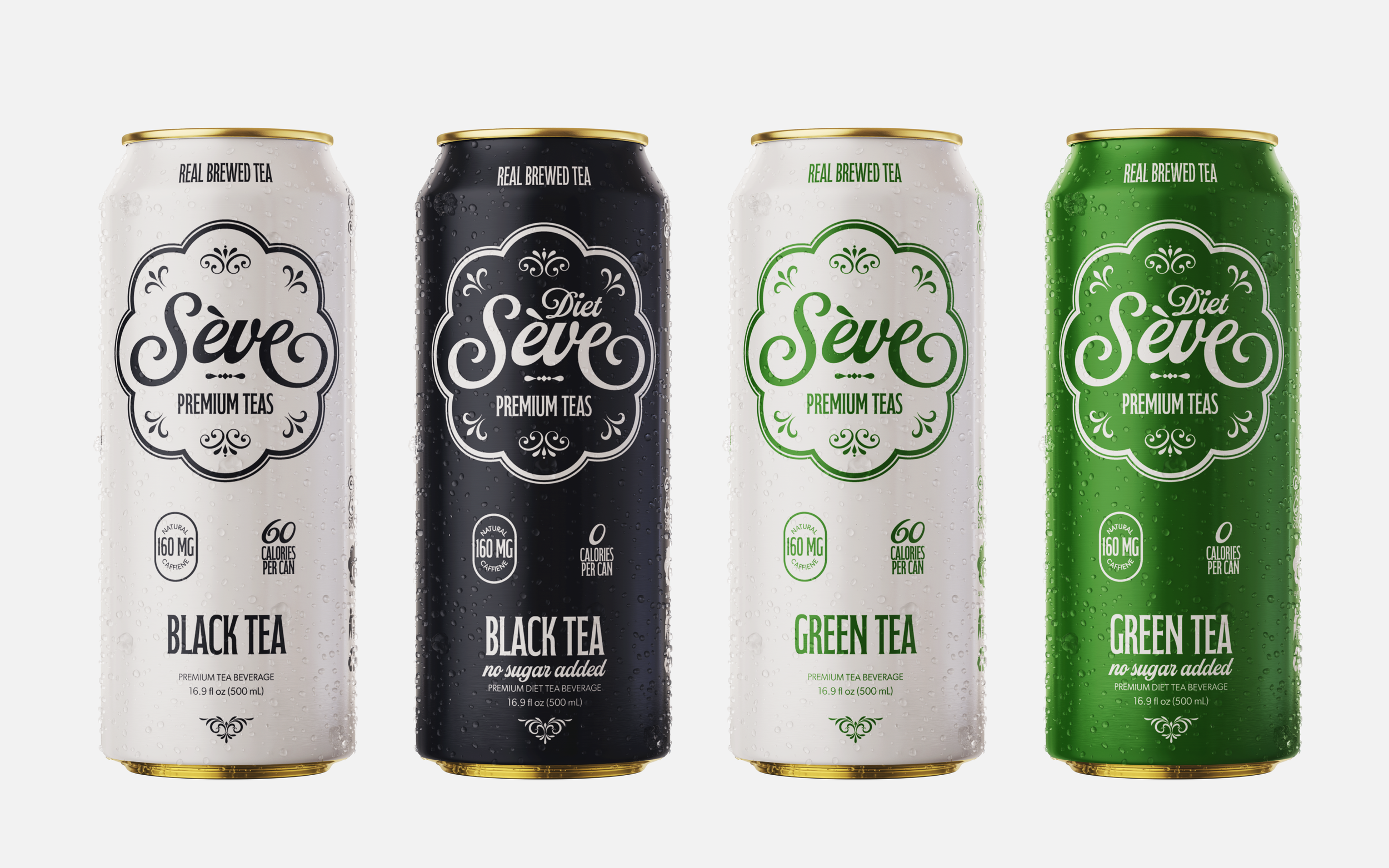
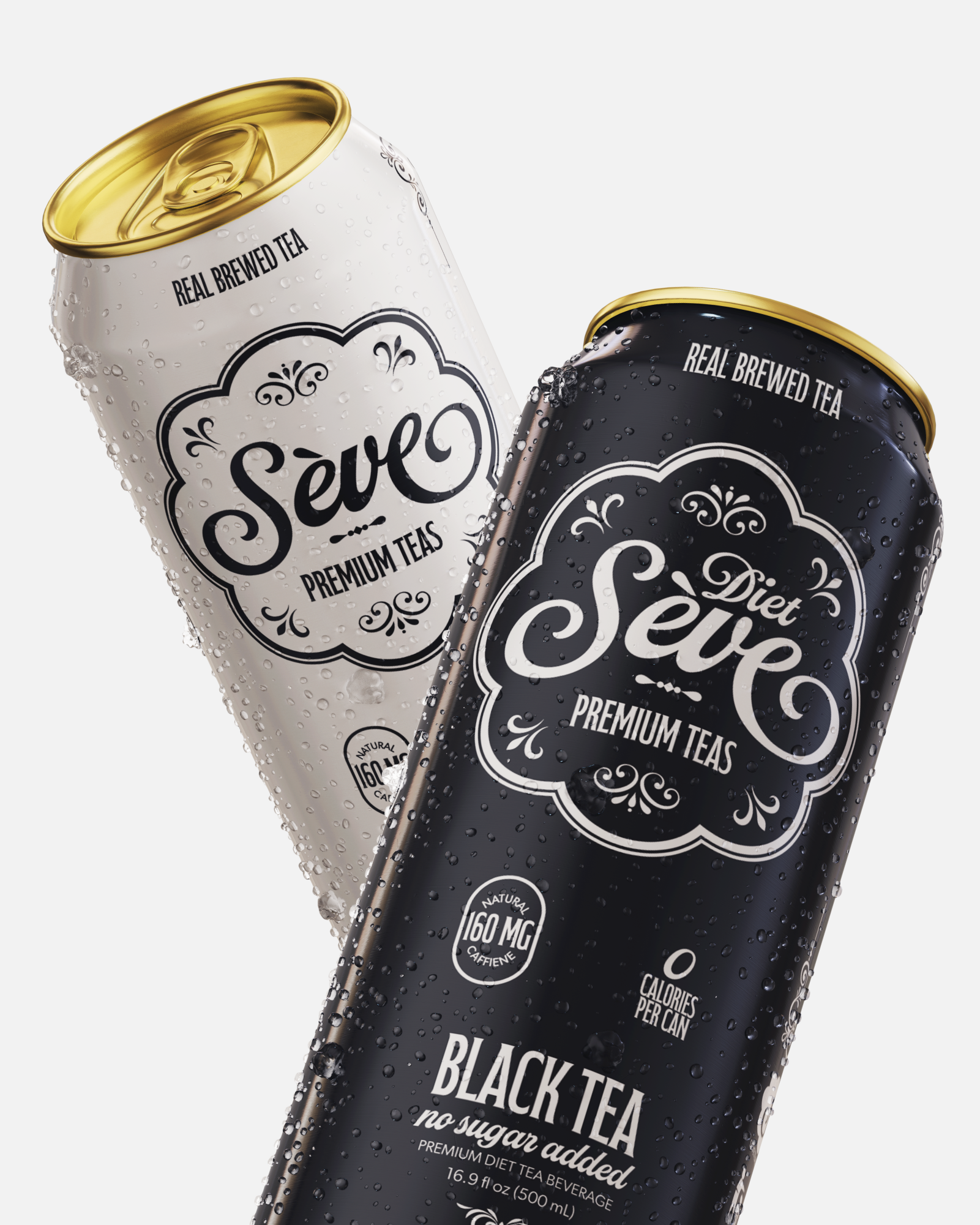
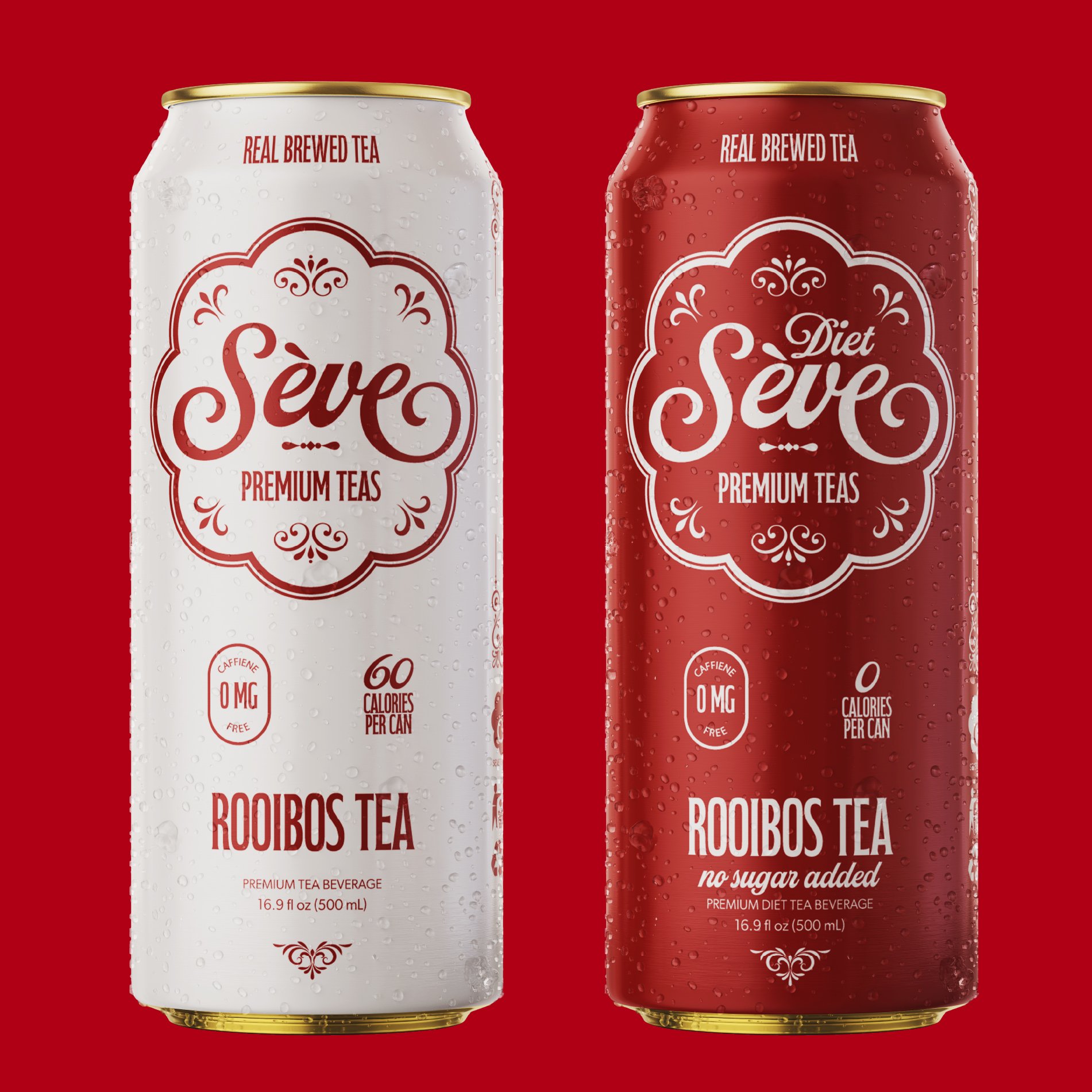
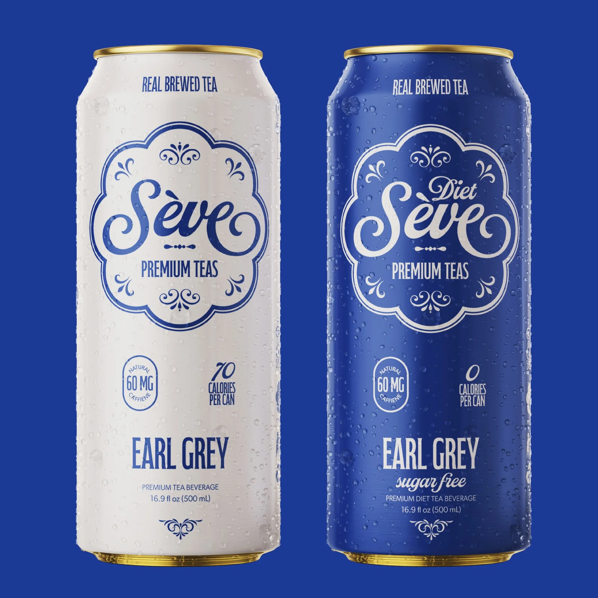
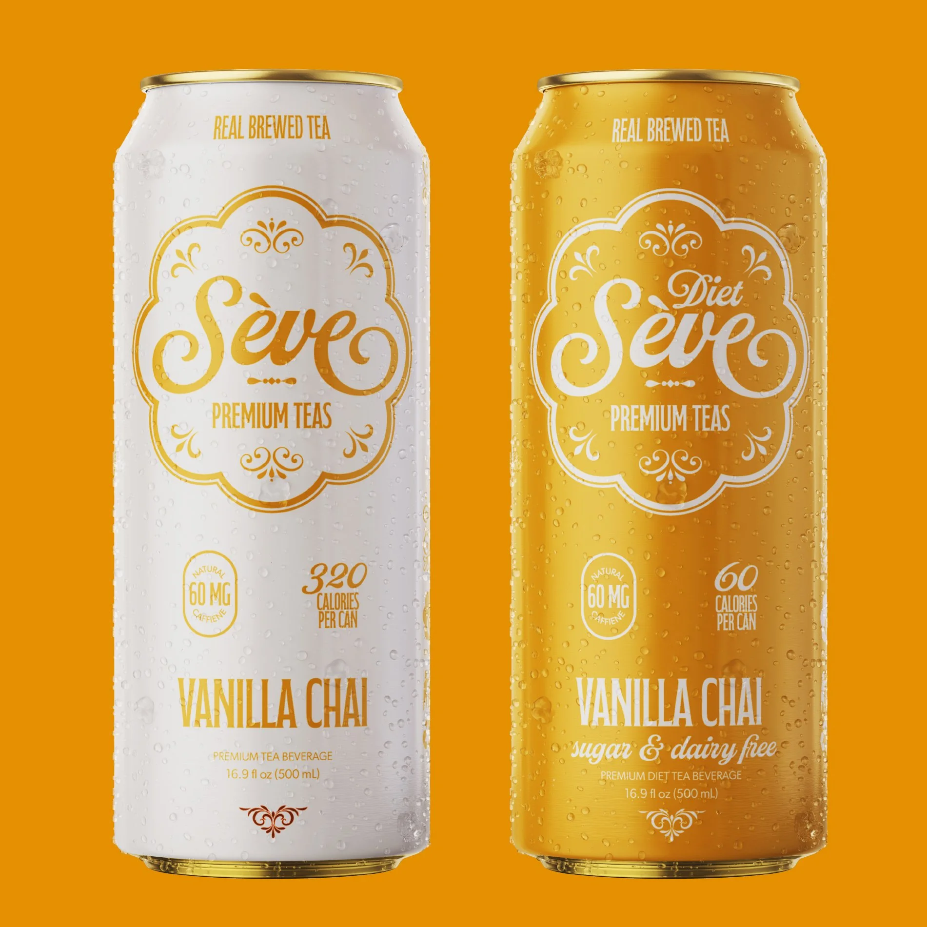
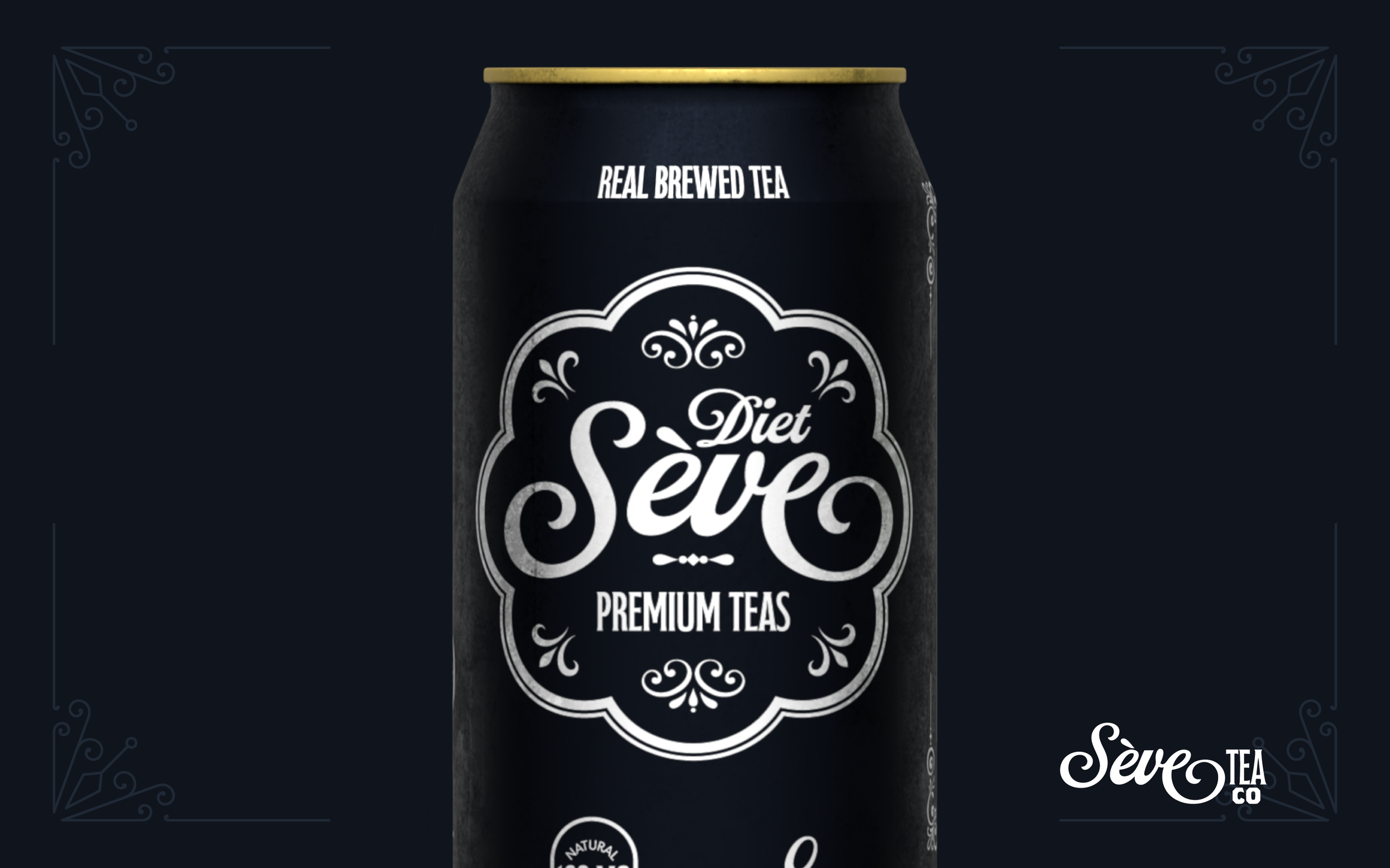
The design of the cans consisted of bold and eye-catching colors.
When shopping, the few seconds customers look at a brand’s packaging is crucial. To maximize on understanding the product in a short amount of time, I kept each of the color pallets of the different flavors associated with their respected flavor. Black tea is black, green tea is green, and so on. I also made sure that select keywords were visible at all times, “brewed” “premium” and “tea” for the regular, and “no sugar added” and “diet” on the sugar free cans.
Instructor
Keith Somers
(Tyler School of Art and Architecture / Temple University)


