OLD WORLD FOOD FESTIVAL
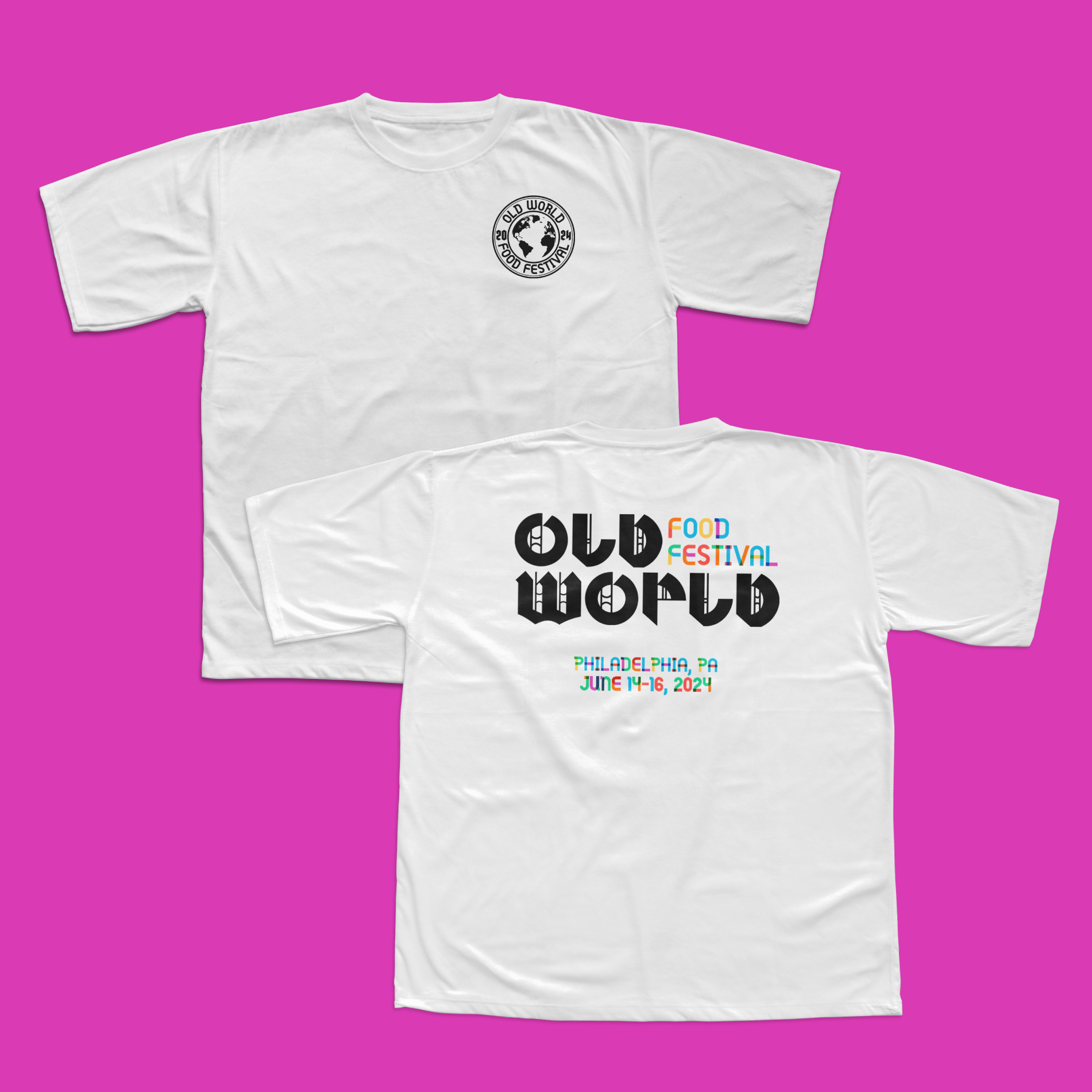
A celebration of the whole world’s history wrapped up all in one delicious packed, the Old World Food Festival. Hypothetically located in Philadelphia, this food fest would be about celebrating all the many cultures in this world and to appreciate the history of food! If you’re a history buff and a foodie, this festival is right up your alley!
Includes
Brand Design
Logo Design
Typography
Package Design
UI/UX
Environmental Design
Software
Adobe Illustrator
Adobe Photoshop
Illuminating history through design…
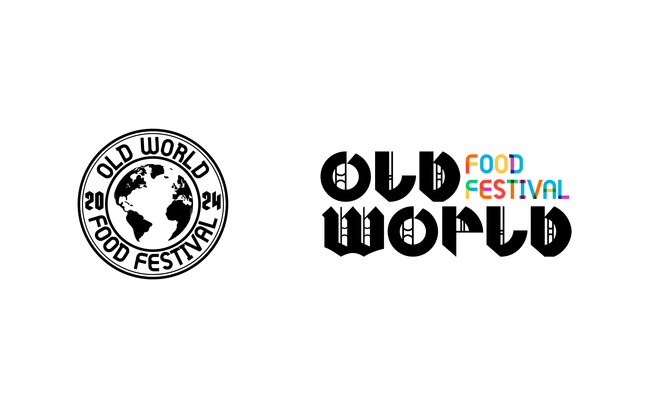
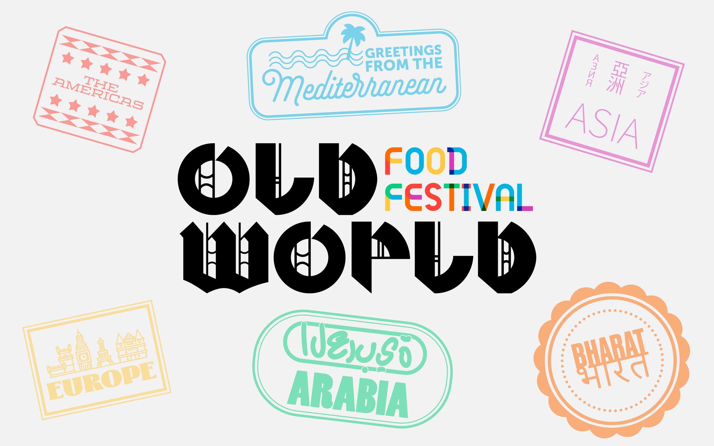
…was what posed as a challenge when I first began this project. Using both elements from modern typography, as well as looking at inspiration of historical illuminated manuscripts, I created a logo using both of these design aesthetics. I also had to be considerate of the demographic here. There would be a wide range of visitors, from all ages, to all backgrounds.
Designing a grand banquet of ideas
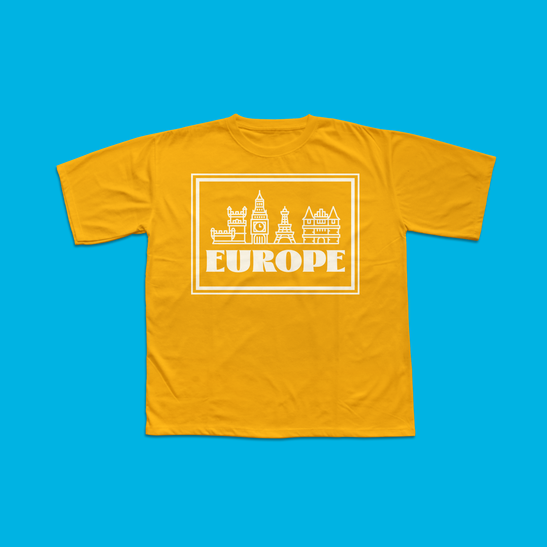
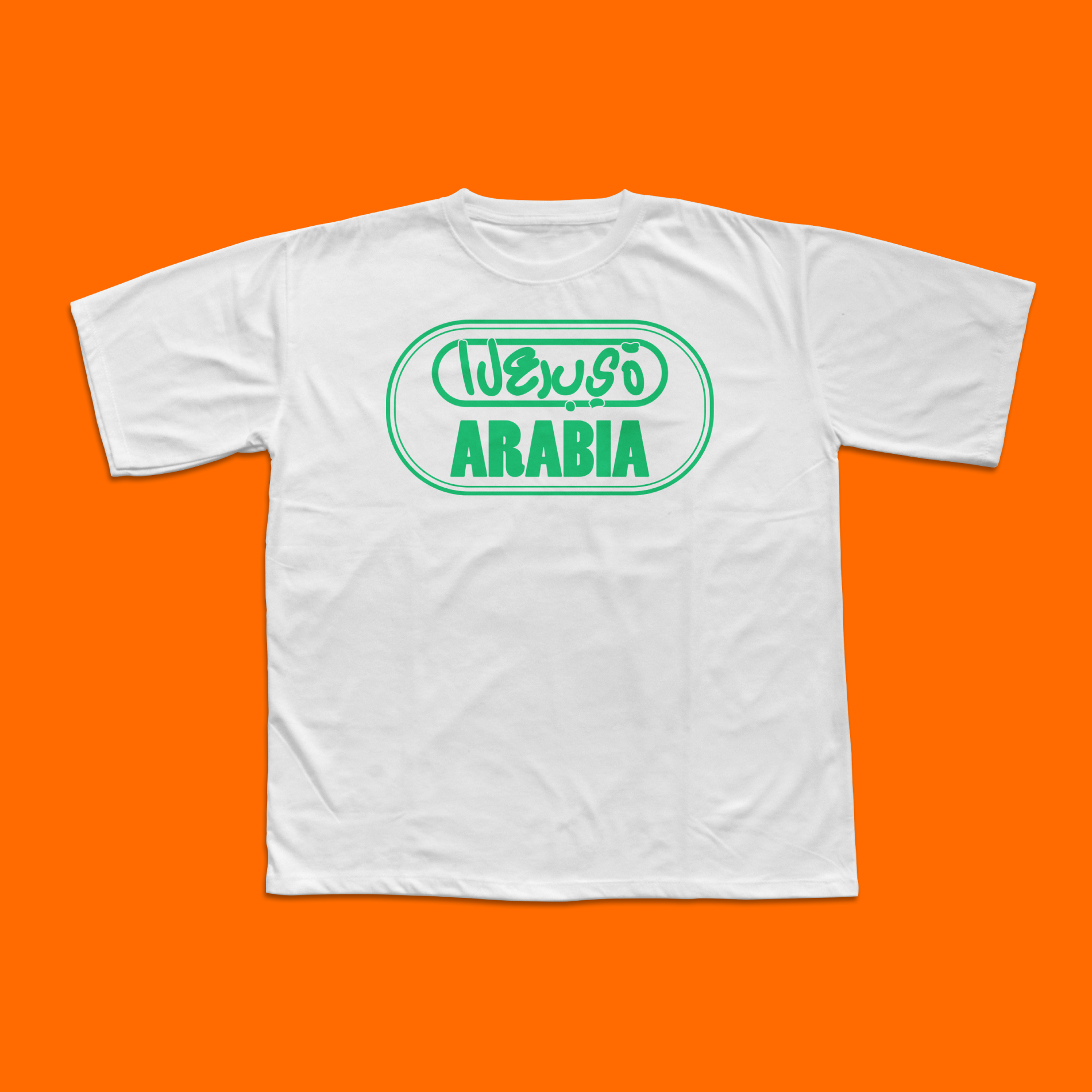
Giving myself such a large scale project meant I had a lot of aspects and elements to incorporate into the brand. With having six different countries/regions to pick design aspects from, I found it easier to get a clear idea by giving each region a “vibe” to say the least.
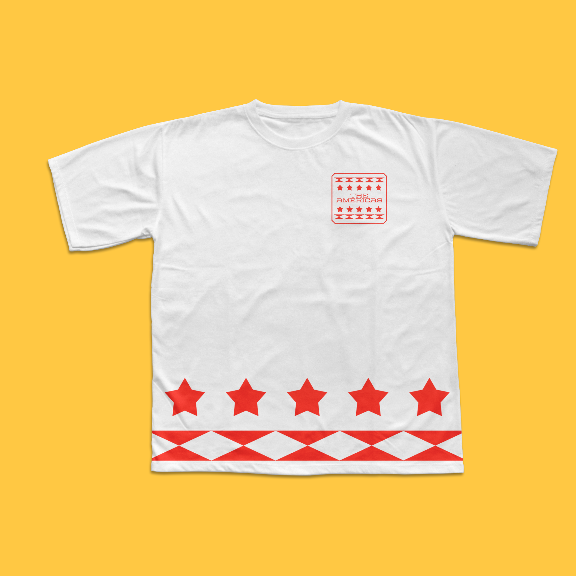
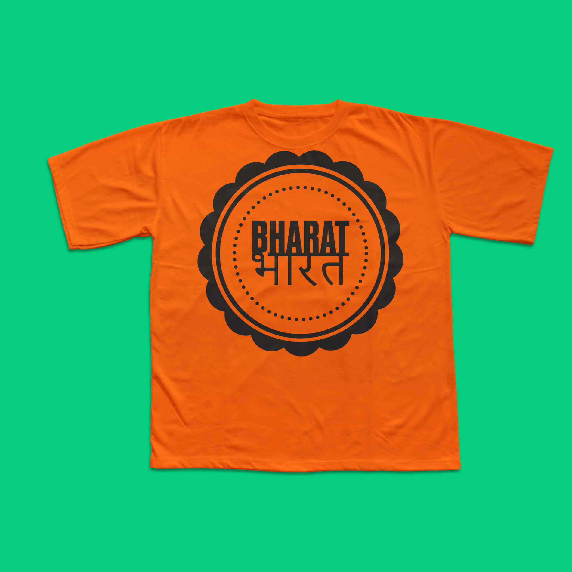
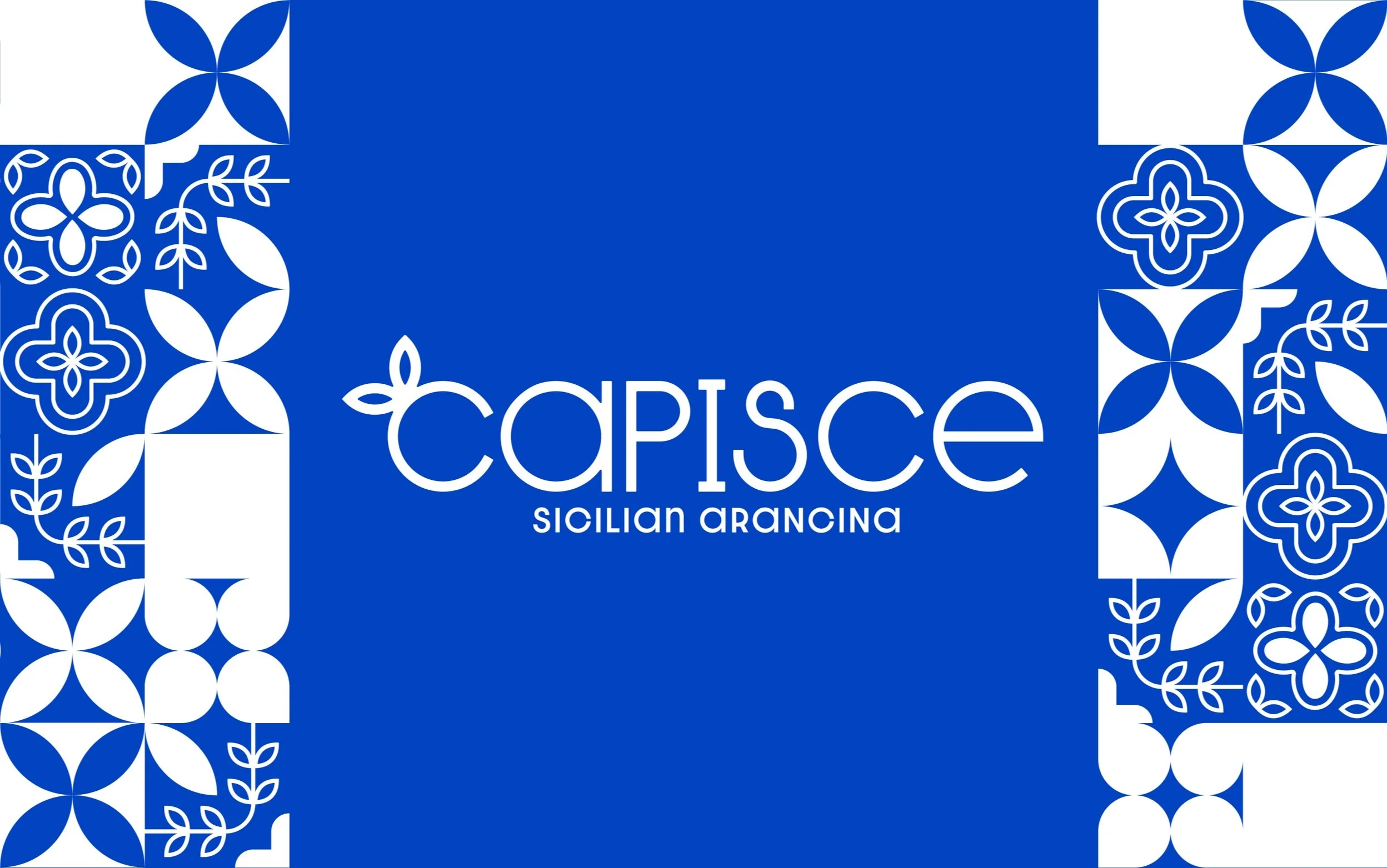
The Mediterranean region was going to be coastal, which is why I chose blue, while Bharat is more warm and known for their many spices, I chose orange to represent that. Using stars and a color scheme of red, white and blue for the Americas helped give off a Star-Spangled banner aesthetic.
Designer’s notes
This project was one of my favorites research wise. Coming up with the names of the different stalls in the different countries was so much fun I forget I was actually doing a project. The logo was one of the parts that took the most iterations. I originally started with a typical black letter, though after a longer while I felt like I needed a bit of a modern touch to make this festival let passerby’s know that it’s more than just for history fans. Using the wide, blocky serifs of modern sans serif fonts combined with a simplified version of blackletter ornamentation. As I was making the letters I noticed how the R, L, and D all basically used the same shape. This whole project was inspired by a YouTube channel I frequent called Tasting History, where the host, Max Miller, makes different recipes from many different periods in time and designates a portion of the video to the history behind said food or recipe and overall it’s very intriguing content. Trying then to reimagine this whole concept of historical foods, I merged it with a love of food festivals and food trucks to create the Old World Food Festival! It was a great project and I really began to gain my confidence as a designer at this point.
Instructor
Keith Somers
(Tyler School of Art & Architecture / Temple University)


