Wanting to go out with a bang, I decided to sign up for a Form Making class in my last semester. This class delves into a very creative art side of design, rather than the commercial side of design as most of us are familiar with.
experimental design
Includes
Typography Design
Poster Design
Object Design
Typeface design
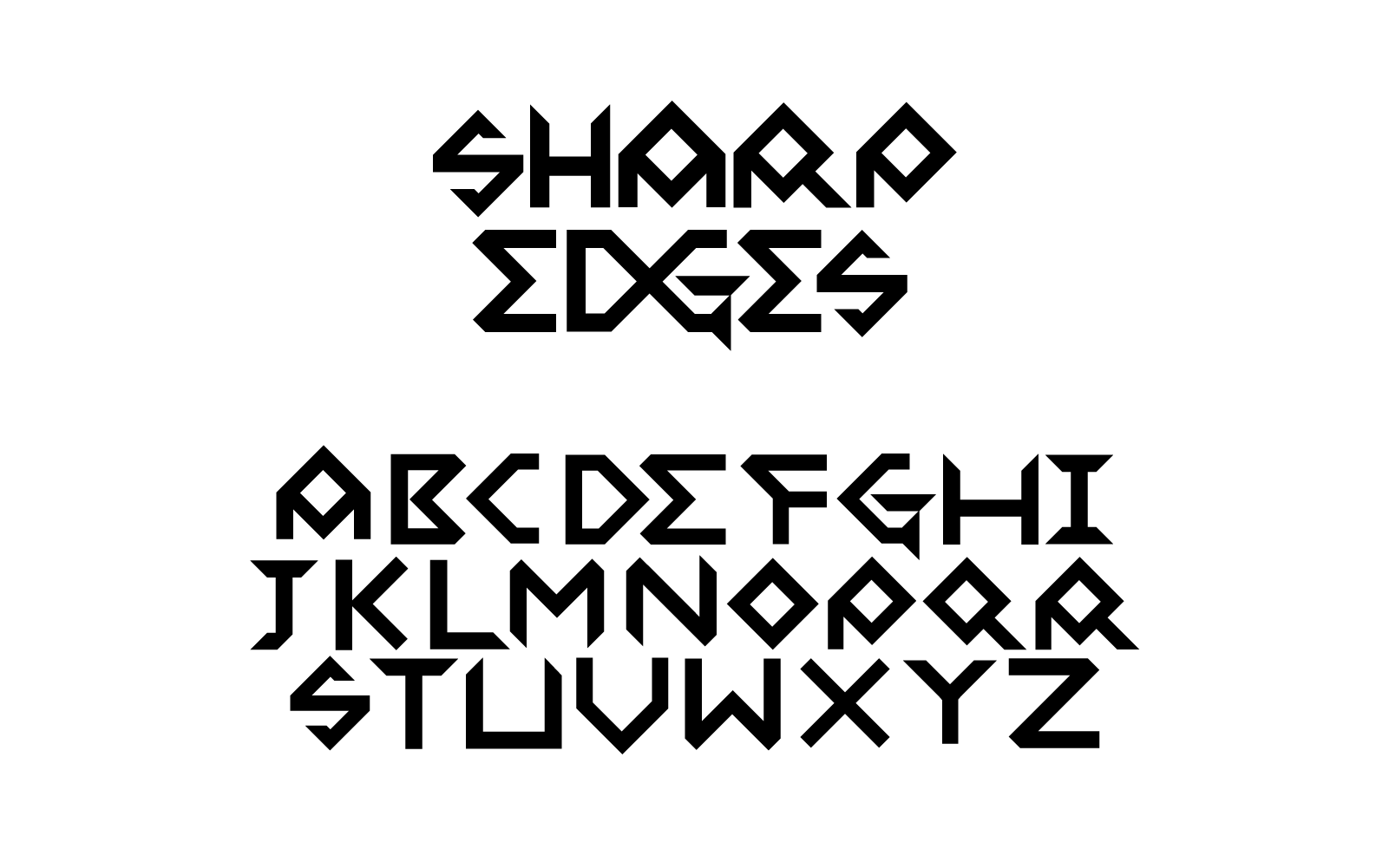
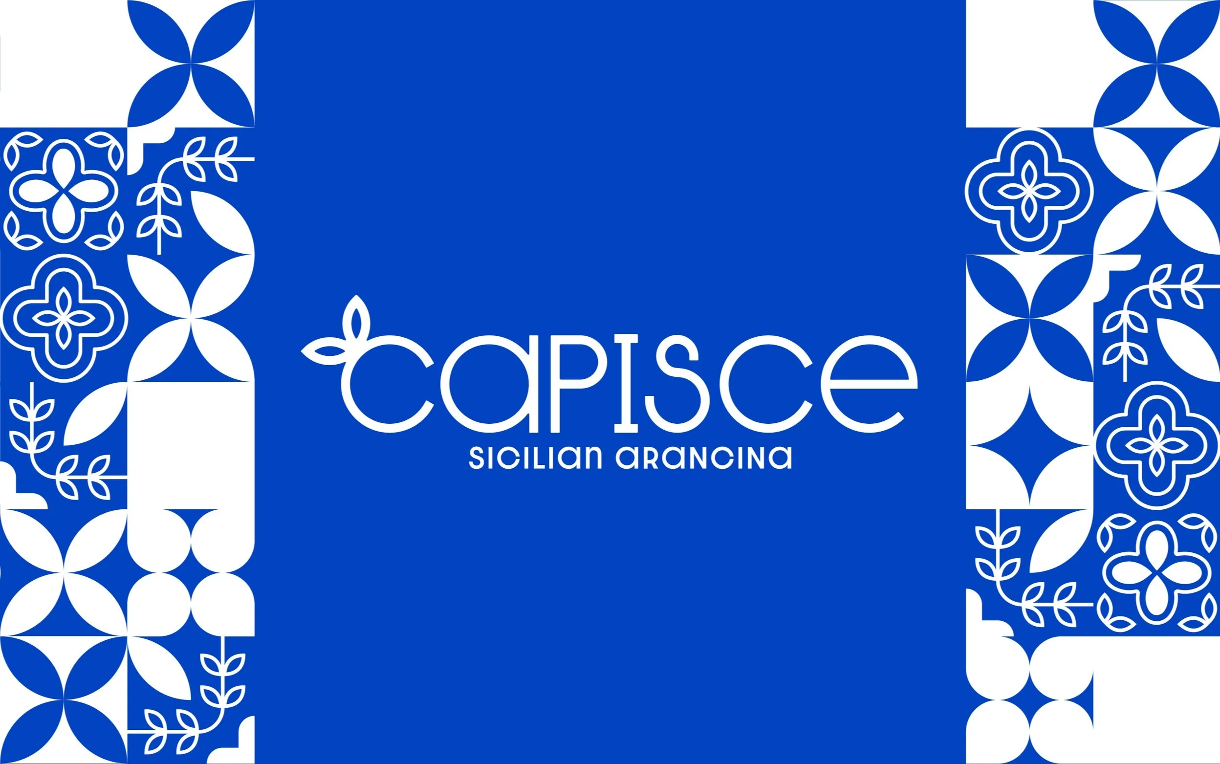
Tasked with creating a typeface, I designed a typeface using sharp edges and diamond shaped counters. After creating the typeface, I wanted to create a mockup to showcase a real world application of the type. There are many ways to apply this type, I especially thought a rock band poster or a mural. With the mural design I worked in the aesthetic of Russian Constructivism Art with the color scheme and sharp edges. I used the song “Bella Ciao” a song known for it’s themes of liberation.
The typeface as it is currently still requires many variants and ligatures, as well as readjusting the kerning, however the download link is below if you’d like to try it.
Download
Sharp-Edges.otf v1
Connection Images
This project consisted of using found images to create a string of images that connected and flowed into one another. I decided to use archive.org to source my images, specifically looking at only pieces that came from the Metropolitan Museum of Art.
Helmet & poster design
One of our projects delved into the tangible world, requiring us to create a piece of art that somehow fit on our body in some place. It could have a second meaning, or just be used to showcase a certain feature or feeling. I knew I needed materials that I had excess of, so I knew aluminum from soda cans would be relatively easy and cheap to get. I based the whole idea around this Spartan looking helmet, with an intent to do some type of propaganda poster.
When designing the poster I delved into the aesthetics of Russian Constructivism, as well as the iconic Uncle Sam posters from 1800s America.
Vernacular Design
Our next section here we have vernacular design. While typically vernacular can be though of slang, or just a specific dialect, in the case of vernacular design it can be considered as a visual aesthetic from a specific time period and place. Think of the American Roaring 20’s or German Expressionism. There’s a lot of design vernaculars, everywhere you look, so a project consisting of a poster that only had the words “Vernacular Spectacular” was more or less an open prompt.
I chose to go for two very distinct vernaculars. As mentioned above, before this project, I always thought of vernacular as language. So my mind then went to: “What’s the oldest language?” and as a big fan of Ancient Mesopotamia, I decided to go for a cuneiform tablet. As for my second poster, I wanted the opposite. I chose an old Game Boy aesthetic with a green color scheme and pixel art. I also chose to include some other vernaculars with the “Cool ‘S’” being it’s own vernacular because of how it defines a design aesthetic of elementary and middle school kids of the late 90s and Early 2000s!
‘veffekt’ poster
Our next experiment was to mess around with a term our professor introduced to us, Veffekt, or Verfremdungseffekt, a German word meaning “distancing effect.” The purpose of this effect is to take an image and defamiliarize it, as my professor put it, essentially “forcing the viewer to experience something familiar in an unfamiliar way.”
I decided to choose a button up shirt I had seen at the mall the weekend prior, zoomed in far and inverted the colors. Lastly all we had to do was include the title “Our what is a how” from Michael Rock’s Fuck Content (2009) passage.
Below is the process I took for creating this image.
Instructor
Nathan Young
(Tyler School of Art & Architecture / Temple University)


